Design
Color Palette Guide for Creators
A creator-friendly guide to building color palettes that look intentional, stay readable, and work across websites, graphics, and campaigns.
Decide What the Palette Needs to Do
A color palette should solve a communication problem. A portfolio may need to feel personal and expressive. A SaaS dashboard may need calm, scannable colors. A restaurant menu may need warmth and appetite appeal. A study tool may need clarity and low visual fatigue.
Before choosing colors, write down the context: where the colors will appear, who will use them, what action matters most, and whether the design needs to feel playful, serious, premium, practical, educational, or energetic.
Build Around a Primary Color
Start with one primary color that carries the main identity. This might be the color used for buttons, active states, headings, or brand marks. The primary color should be distinctive enough to remember but flexible enough to use repeatedly.
Once the primary color is chosen, add support colors with a purpose. A secondary color can create variety. An accent can draw attention. Neutrals can hold the layout together. Avoid choosing five loud colors and then forcing them to compete on every screen.
Use Contrast as a Design Rule
Good color is not only about taste. It also has to be readable. Text, buttons, labels, and forms need enough contrast to work on different screens and in different lighting. Light gray text on white may look elegant in a mockup but become difficult to read for real users.
Check contrast for body text, small labels, call-to-action buttons, navigation, and error states. If a color is beautiful but cannot support readable text, use it as a background wash, icon accent, or decorative detail instead of a core text color.
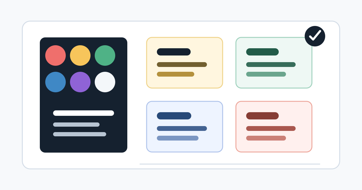
Create a Simple Usage System
A palette becomes useful when each color has a role. For example: dark neutral for text, white or near-white for surfaces, primary blue for main actions, green for success, amber for warnings, and red for destructive actions. This keeps the design predictable.
Creators can use the same approach for social graphics and brand content. Pick colors for headline backgrounds, captions, links, highlights, and separators. Consistency helps people recognize your work faster.
Avoid One-Note Color Choices
A palette made only from one hue can feel flat unless the design is very deliberate. Blue on blue on blue, beige on beige, or purple gradients everywhere may look polished at first, but it can reduce hierarchy and make every element feel similar.
Add balance with neutrals, warm and cool contrast, or a restrained accent. The goal is not to make the page colorful everywhere. The goal is to guide attention and make the important parts easier to understand.
Test the Palette in Real Content
A palette that looks good as swatches can fail inside real content. Test it on headings, paragraphs, cards, buttons, forms, images, charts, and mobile screens. If the palette only works in a mood board, it is not finished yet.
Use real text lengths and realistic images. Check hover states, selected states, disabled states, and error messages. The palette should still feel organized when the page contains messy, real-world content.
Use Generator Website Tools to Explore Safely
The Color Generator can help you explore combinations quickly. Pair it with the Typography Generator to see whether your colors support readable type. If you are creating visuals with an AI Image Generator, reuse your palette language in the prompt to keep images consistent.
Once you like a palette, save the exact color values and define where each one belongs. A clear color system is easier to reuse than a screenshot of nice swatches.
Tools Mentioned in This Guide
Related Guides
- Typography Pairing GuideA practical guide to choosing font pairs that look intentional, read clearly, and support the content instead of distracting from it.
- How to Write Better AI Image Generator PromptsA clear prompt framework for getting more useful AI-generated images, with examples, review steps, and responsible publishing tips.
- How to Review AI-Generated Images Before PublishingA practical editorial checklist for reviewing AI-generated images before using them in blogs, tools, marketing pages, or social content.
- QR Code Best Practices for Small BusinessesUse QR codes with more confidence by planning the destination, testing the scan experience, and making each code useful for customers.
Frequently Asked Questions
How many colors should a palette have?
Most creator palettes work well with three to six colors: a primary color, a secondary color, one or two accents, a background color, and a text color with strong contrast.
What makes a color palette readable?
A readable palette has enough contrast between text and background, clear action colors, and restrained accent use so important content does not compete with decoration.
Should every brand color be used equally?
No. A good palette has hierarchy. One or two colors usually do most of the work, while accent colors are saved for highlights, buttons, labels, or visual emphasis.