Design
Typography Pairing Guide
A practical guide to choosing font pairs that look intentional, read clearly, and support the content instead of distracting from it.
Choose the Reading Job First
Typography is not only visual style. It controls how quickly people understand a page. A blog post, landing page, resume, dashboard, logo, invitation, and social graphic all ask type to do different jobs.
Before pairing fonts, decide which text must be read carefully and which text only needs to create identity or emphasis. Body copy, labels, and instructions need clarity. Headlines can carry more personality if they still stay legible.
Start With a Strong Body Font
Many creators choose a decorative headline font first, then struggle to make paragraphs work. A better workflow starts with the body font. If the body text is hard to read, the design fails no matter how attractive the headline looks.
Look for clear letter shapes, comfortable spacing, readable numbers, and enough weights for headings, emphasis, and buttons. Test real paragraphs, not only the alphabet. Some fonts look beautiful in a sample but become tiring in long reading.
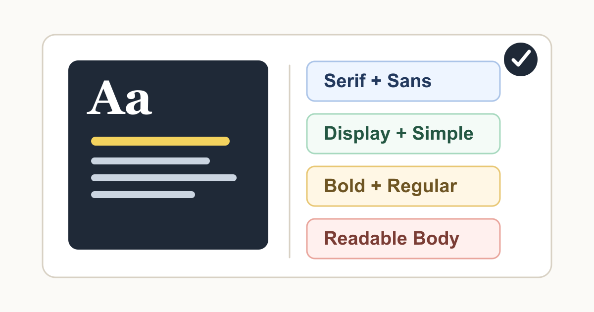
Pair Fonts With Useful Contrast
Good font pairs usually contrast in a way the reader can understand. A serif headline with a sans-serif body can feel editorial. A bold geometric headline with a neutral body can feel modern. A display font with a simple text font can add personality without sacrificing clarity.
Avoid pairing fonts that are almost the same but not quite. Two similar sans-serif fonts can look like a mistake unless you have a clear reason. If the fonts are different, make the difference obvious. If they are similar, use one family instead.
Use Weight and Size Before Adding More Fonts
A single font family can often create a complete system. Use bold for headings, regular for body text, medium for buttons, and smaller sizes for labels. This keeps the design clean and easier to maintain.
Add a second font only when it solves a real problem: stronger brand identity, editorial contrast, or a special use case such as quotes or display titles. More fonts usually mean more decisions, more inconsistency, and more opportunities for clutter.
Check Hierarchy on Real Layouts
A font pair is only successful if the page hierarchy is obvious. Users should be able to tell the difference between the page title, section headings, body text, links, buttons, captions, and helper text without thinking too hard.
Place the fonts into real layouts before deciding. Try a mobile screen, a desktop article, a card grid, a form, and a navigation bar. If everything feels the same weight or the headline overwhelms the content, adjust the scale and spacing.
Keep Decorative Type in Small Doses
Calligraphy, script, retro, handwritten, or highly stylized fonts can be useful for logos, invitations, posters, and short display moments. They become harder to read when used for paragraphs, navigation, forms, or small labels.
If you use decorative type, pair it with a plain supporting font and give it room. Let the decorative font be the moment, then let the rest of the design do the practical reading work.
Use Generator Website Tools to Compare Options
Use the Typography Generator to explore pairings and hierarchy ideas. Then use the Color Generator to check whether your type still reads clearly with the palette you chose.
The final test is simple: can a real reader scan the page, understand the next action, and read the content comfortably? If yes, the pairing is doing its job.
Tools Mentioned in This Guide
Related Guides
- Color Palette Guide for CreatorsA creator-friendly guide to building color palettes that look intentional, stay readable, and work across websites, graphics, and campaigns.
- How to Review AI-Generated Images Before PublishingA practical editorial checklist for reviewing AI-generated images before using them in blogs, tools, marketing pages, or social content.
- How to Write Better AI Image Generator PromptsA clear prompt framework for getting more useful AI-generated images, with examples, review steps, and responsible publishing tips.
- QR Code Best Practices for Small BusinessesUse QR codes with more confidence by planning the destination, testing the scan experience, and making each code useful for customers.
Frequently Asked Questions
How many fonts should I use in one design?
Most designs work best with one or two font families. Use weights, sizes, spacing, and color to create variety before adding a third font.
What is the easiest font pairing rule?
Pair contrast with restraint. A distinctive headline font can work with a simple body font, but two decorative fonts usually compete and reduce readability.
What matters most for body text?
Body text should be readable at the actual size where people will read it. Check line height, character shapes, paragraph width, and contrast before choosing a font for long content.